

Designing a Food Application (A UX Case Study)
Product Overview
WaraChow is a food retail store which presently reaches its customers via social media. It currently serves Lagos residents. The company realized it was time it positions itself closer to its customers. So this led to the idea of developing a mobile application.
Problem
Ordering food online in Nigeria in the Digital Age is like rocket science. A lot of food retail outlets do not have functional mobile apps. Those who have do not prioritize it, and most of the applications have ‘CRAPPY UI.’ The ‘new Nigerian customer’ wants to sit at the comfort of his/her home or is extremely busy at work, therefore needing an application where orders can be made swiftly and have them delivered.
My Role
User Experience Research and User Interface Design.
Users/Audience
B2C – Busy Professionals who are internet savvy and based in Lagos.
B2B – Companies that cater to lunch for their staff and also have celebrations
User Persona
WaraChow is a ‘baby company’ to WaraCake.com.
The company has had significant working-class customers who purchase cakes for their loved ones.
I created a survey for them requesting that they share about things they would want in a food application if they were to use one.
Here is a sample persona I developed below.

User Story
Sarah will like to order a take-out for her husband while she’s at work. She needs a reliable restaurant that allows her to pay online, schedule delivery dates, and have access to a wide variety of food choices. Her husband is not so picky and will eat almost anything.
Sarah plans to stick to a single restaurant and make purchases down for a whole week so she can focus on work. Sarah does not like applications that are: not easy to navigate, applications that do not have social login, applications that do not save your details for easy ordering, and applications that do not save your previous orders to make quick orders.
Style Guide
Font: Avenir with the Variants – Heavy, Roman, Book, Light.
Color Palette Accent: FF785B
Main App Background Color: Linear – FBEDEA; 100% Opacity, FFFDFD; 100% Opacity
Buttons: FF785B
Tool Used:

Wire Frames

User Journey (Flowchart)

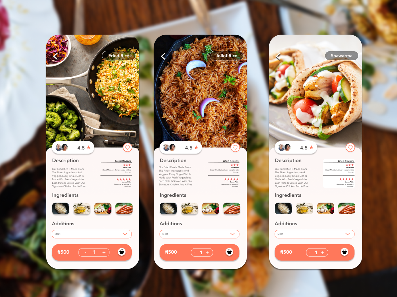
Final Visual Interface

Key Takeaways
Even though an excellent UI is essential, researching about critical pains of the users should remain a priority. The visual experience is vital, but functionality is equally important.